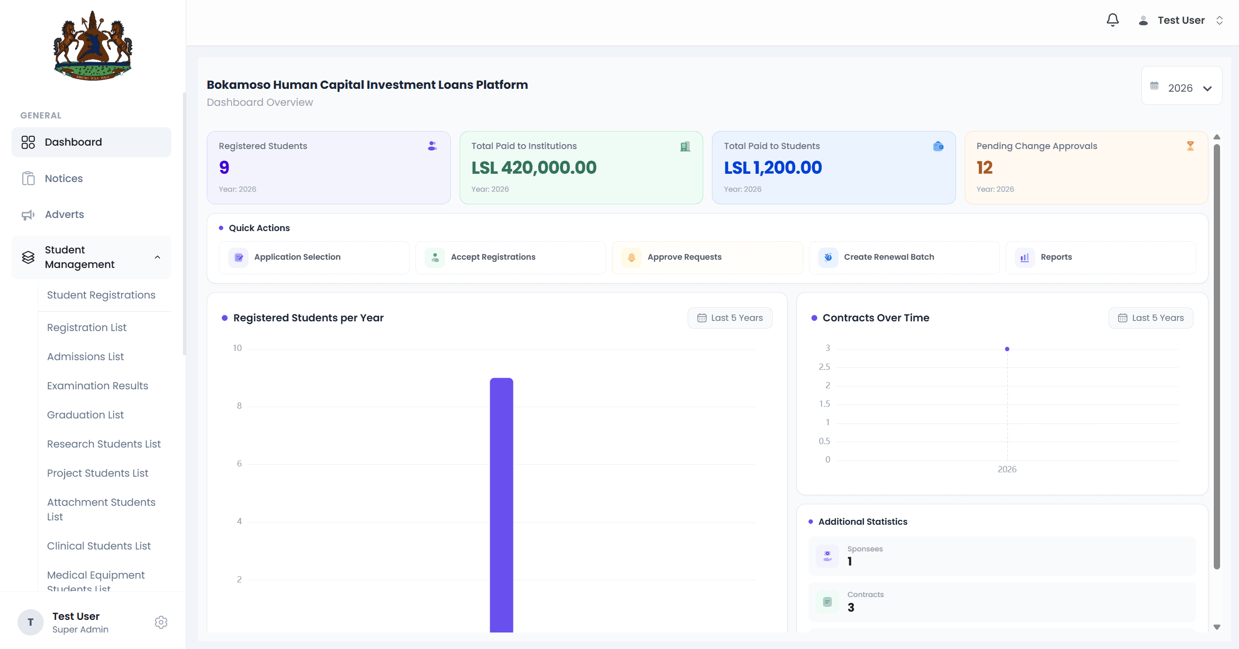
What & Why
Project Overview
Bokamoso is a platform built for the National Manpower Development Secretariat (NMDS) in Lesotho. It manages student loans and sponsorships — the funding that allows students to pursue higher education, and the mechanism government tracks and administers that support through.
Before a system like this exists, processes like these are often paper-based or scattered across disconnected tools. Applicants struggle to know their status, and administrators struggle to track applications at scale. Bokamoso brings applicants, borrowers, administrators, and government stakeholders into a single, centralized system.
It solves a coordination problem: education funding involves many parties and many stages, and the platform gives every one of them a clear, shared view of where each application stands.
Contribution
My Role
I worked as a Frontend Engineer on Bokamoso, building and maintaining the interfaces applicants, administrators, and government stakeholders use day to day. My contribution was focused entirely on the frontend — I didn't design the backend systems or the eligibility logic, but I was responsible for turning that logic into something people could actually use.
What Made This Hard
Engineering Challenges
Supporting Multiple User Roles
Applicants, borrowers, administrators, and government stakeholders all needed different views into the same underlying data — each with different permissions and priorities.
Complex Multi-Step Workflows
Loan and sponsorship applications move through several stages of review. The interface had to make progress and status legible at every step, not just at submission.
Long Application Forms
Education finance applications require significant detail. The challenge was keeping long forms manageable without losing user progress or overwhelming first-time applicants.
Reusable UI Components
With multiple roles and workflows sharing similar patterns, components needed to be built once and adapted safely across contexts, rather than duplicated per screen.
Responsive Layouts
Applicants and administrators access the platform from a wide range of devices, so every workflow needed to hold up from a small phone screen to a desktop review console.
Working Within an Existing Architecture
This was production software with existing conventions and constraints already in place — new features had to fit the system as it existed, not the system I'd design from scratch.
System Design
Architecture
Built With
Tech Stack
React
Component-based UI
TypeScript
Type safety across the app
GraphQL
Structured API contracts
Azure DevOps
CI/CD & work tracking
Git
Version control
How & Why
Engineering Decisions
Reusable Components
Shared UI — form fields, status indicators, review tables — was built as a small set of configurable components rather than one-off screens, so new workflows could compose from existing pieces instead of duplicating them.
Responsive Layouts
Layouts were built mobile-first and tested across breakpoints, since applicants and administrators use the platform on very different devices and connection speeds.
API Organisation
Frontend requests were organised around the platform's real workflows — application, review, sponsorship — rather than around raw backend endpoints, so the interface stayed readable as the API evolved.
State Management
State was kept as close to where it was used as possible, with shared state reserved for genuinely cross-cutting concerns like the logged-in user's role and active application context.
Component Structure
Components were structured around a clear separation between presentation and workflow logic, which made it easier to reason about a screen without tracing every dependency.
Performance Considerations
Long forms and review tables were built to avoid unnecessary re-renders and to load data incrementally, keeping the interface responsive as application volume grew.
Maintainability
Where implementation details were proprietary or ambiguous by the time of writing, the underlying principle was consistency — following existing patterns in the codebase rather than introducing new ones for the sake of it.
Interface
Screenshots
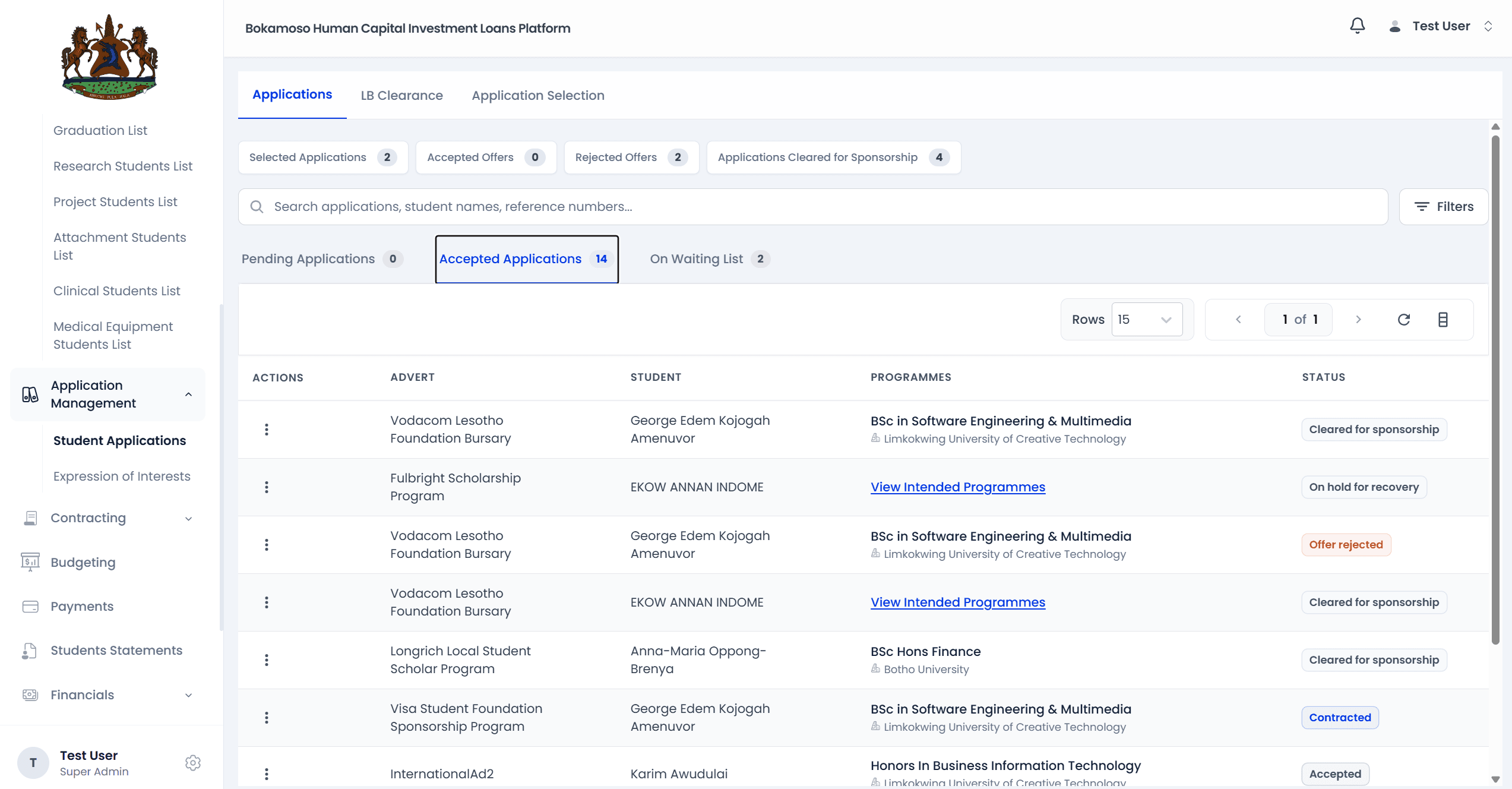
Administrator Review Interface
What You're Viewing
The queue administrators and government stakeholders use to process applications.
Why It Matters
Staff needed to move through applications efficiently, without being shown information irrelevant to their role.
Problem Solved
Built role-based views that surface only the data and actions relevant to each type of reviewer.
At A Glance
Engineering Highlights
Responsive Design
Consistent across phone, tablet, and desktop
Reusable Components
Built once, composed across workflows
API Integration
Structured requests around real workflows
Accessibility
Usable with keyboard and assistive tech
Maintainability
Consistent patterns over clever ones
Frontend Architecture
Clear separation of UI and logic
Production Software
Shipped to real users, not a demo
Collaborative Development
Built alongside backend & product teams
Reflection
Lessons Learned
Working on production software is different from working on a personal project. Every change I made was going to be used by real applicants and real administrators, so decisions I might have deferred on a side project — edge cases, empty states, what happens when a form is half-filled and the user leaves — became things I had to actually resolve.
Collaborating with other engineers on an existing codebase taught me to read intent before I changed anything. It's easy to introduce a new pattern because it feels cleaner in isolation; it's harder, and usually more valuable, to extend what's already there consistently.
I also learned to hold business requirements and technical constraints in the same hand. Government and enterprise software comes with rules that aren't negotiable — eligibility criteria, approval hierarchies — and the frontend's job was to make those rules legible without pretending they were simpler than they were.
With Hindsight
What I'd Improve Today
None of this is a critique of the project as it was built — it reflects how I've grown as an engineer since, and what I'd bring to a similar system now.
Component Architecture
I'd push further toward a shared design-system layer from day one, rather than letting reusable patterns emerge midway through the project.
Automated Testing
I'd invest earlier in automated coverage for the multi-step workflows specifically — they're where regressions are easiest to introduce and hardest to spot manually.
Performance Optimisation
I'd profile the long review tables sooner, rather than treating performance as a concern to revisit once volume became noticeable.
Accessibility Enhancements
I'd formalise accessibility checks as part of the review process, instead of addressing issues as they were individually reported.